An effective customer-centric website design requires the designer to put himself in the customer’s place to build a site that is user-friendly, while providing all the information that the visitor needs. If you find it hard to put yourself in your customer’s shoes, there are services out there that will critique the usability of your website for you. Some, like theuserismymom.com and theuserisdrunk.com take it a step further…
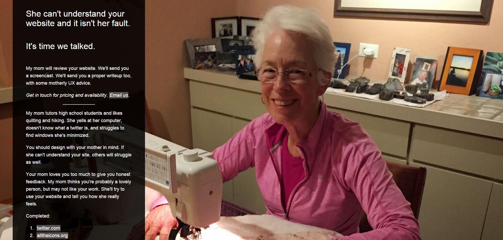
www.theuserismymom.com
This website offers a 64-year-old mother to test websites, saying “You should design with your mother in mind. If she can’t understand your site, others will struggle as well. Your mom loves you too much to give you honest feedback. My mom thinks you’re probably a lovely person, but may not like your work. She’ll try to use your website and tell you how she really feels.”
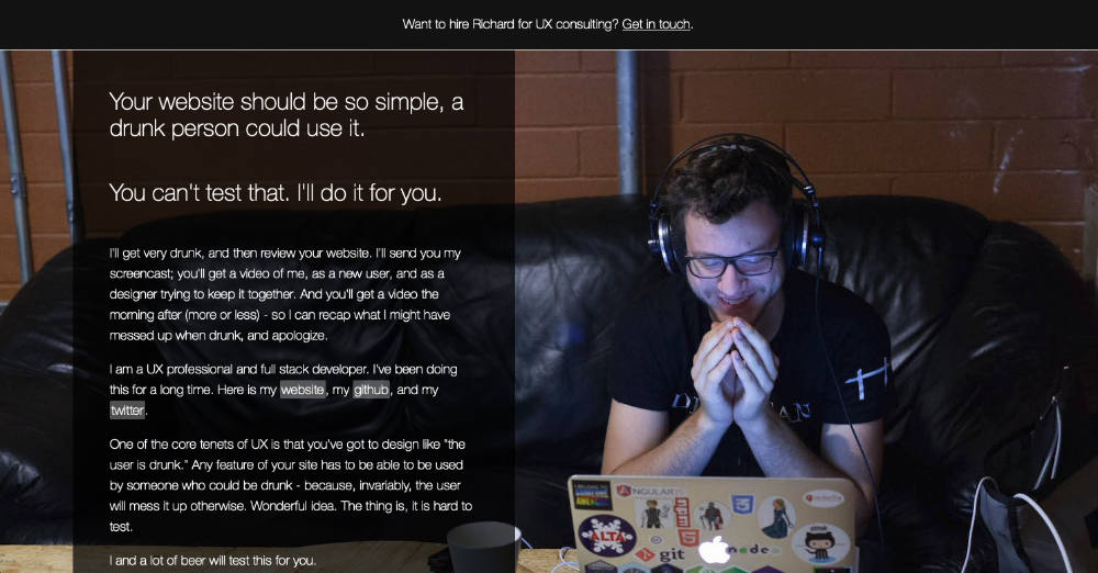
www.theuserisdrunk.com
This website offers a UX professional that sacrifices his liver for the betterment of the information superhighway. “I’ll get very drunk, and then review your website. I’ll send you a document outlining where I thought the website needed help, and a screencast of me going over the website… One of the core tenets of UX is that you’ve got to design like “the user is drunk.” Any feature of your site has to be able to be used by someone who could be drunk – because, invariably, the user will mess it up otherwise. Wonderful idea. The thing is, it is hard to test. I and a lot of beer will test this for you.”
The point is that your website design should be so simple and intuitive that anyone, including sexagenarians (it’s not a bad word, look it up) and drunks, can use it. If you want to try reviewing your website on your own, here are some tips to keep in mind:
Ease of Use
The design should be clearly organized and easy to navigate. A website with well-designed navigation should help a visitor find what they need with minimal effort. Visitors who cannot find what they are looking for will likely to get frustrated and find another website.
Mobile Friendly?
Make sure you look at your website on a phone. Is it a mobile-friendly design that is responsive to the size of the screen, or does the viewer have to zoom and pan each page? A study shows that if a company has a bad mobile website, 39% of visitor will look for another business and 6% of people will refuse to do business with those who have bad mobile websites. For more about mobile-friendly design, read here and here.
Contact information
Is your contact information always just one click away? Don’t make visitors work too hard to reach you.
Spelling Errors
While this might not be enough of a problem to make people lose all faith in your company and leave your website, sloppiness is never a good sign. There are free tools out there to spell check your website, like typosaurus.
Your website is one of your brand touch points, and for many of your customers, it will be their first interaction with you. Make sure that your website meets their needs. If you have questions about your website, please feel free to give us a call at (574) 234-2060.