According to a recent study, mobile device usage is significantly higher than desktop usage, with people viewing 51% of the content on mobile versus only 42% on desktop/laptop. (Five years ago, it was 12.5% mobile vs. 75% desktop/laptop).

Which means that many of your website’s visitors will be viewing your site from their mobile phones and you need to make sure your site is mobile-friendly—one that loads and displays correctly on a mobile device so visitors can have the best user experience.
Earlier this year, Google announced that it will be expanding its use of mobile-friendliness as a ranking signal. Google indicated that this change will affect mobile searches (not desktop searches) and “will have a significant impact in Google Search results. Users will find it easier to get relevant, high quality search results optimized for their devices.”
What is a “mobile friendly” website? It responds to the size of the device that you are using, and displays correctly on that devices. The webpages are easy to read and easy to navigate, no matter what device you are on.
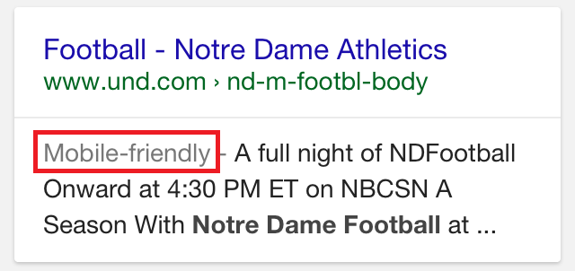
I did a search for “Notre Dame Football” and went to two different pages that appeared in the Google Search results.

Websites on Laptop Screens


Same Websites on Phone Screens

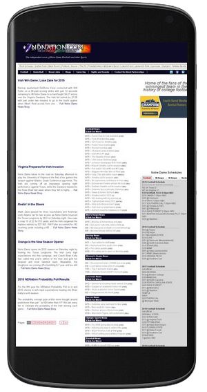
Obviously, one of these sites responds to mobile devices much better than the other. The one on the left is easy to read and navigate, while the text on the one on the right to too small, and each page would have to be zoomed and panned to get the the content. Even people with skinny fingers would have trouble clicking on the correct links.
To see if your website is mobile-friendly, Google offers an easy page to test your site: https://www.google.com/webmasters/tools/mobile-friendly/
Running Google’s mobile-friendly test on the 2 websites above, the results are:
|
Google’s mobile-friendly verdict:Awesome! This page is mobile-friendly. (Google’s wording, not mine) |
|
Google’s mobile-friendly verdict: Page appears not mobile-friendly
|
Having a website that isn’t responsive to mobile devices can affect not only your search rankings, but will also have an impact on the user experience. Websites that are hard to read or difficult to navigate will result in users spending less time on the site.
How does your website measure up? Take the test at Google.
If you need to update your website, please feel free to contact us at Force 5 or call us at (574) 234-2060.