One sign that you might need a new website is that it doesn’t look good on mobile devices. According to a recent study, mobile device usage is significantly higher than desktop usage, with people viewing 51% of the content on mobile versus only 42% on desktop/laptop. (Five years ago, it was 12.5% mobile vs. 75% desktop/laptop).
  |
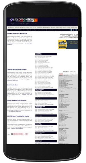  |
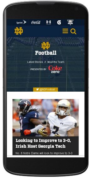
| Mobile Friendly | Not Mobile Friendly |
According to a study by Google, having a website that isn’t mobile-friendly can have a big impact on your business. This study was actually done in 2012, and I would believe that as more websites become responsive, visitors expectations of the mobile experience will also rise.
-
- 67% of mobile users say that when they visit a mobile-friendly site, they’re more likely to buy a site’s product or service
-
- 52% of users said that a bad mobile experience made them less likely to engage with a company
-
- 48% said that if a site didn’t work well on their smartphones, it made them feel like the company didn’t care about their business
-
- 48% of users say they feel frustrated and annoyed when they get to a site that’s not mobile-friendly
-
- 36% said they felt like they’ve wasted their time by visiting those sites
Don’t forget larger screens too.
It’s also important to consider at how your website looks on larger screens. Just a few years ago, websites were built for much smaller computer and laptop screens, but with the advent of wide-screen, high-resolution monitors, old websites can look small and out of place.
So, it is important that your visitors experience your website as you intended, not matter what type of device or monitor they view it on.
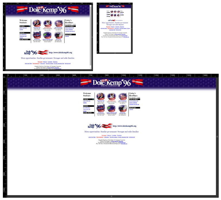
Dole/Kemp website at 800×600 (older monitor), 320×480 (iPhone 4), and 1920×1080 (widescreen). The website would be unnavigatable on the iPhone, and ends up looking puny on a current-sized monitor. Obviously, the Dole/Kemp website was created 20 years ago, long before iPhones and widescreen, high-resolution monitors, but there are still many current websites that follow this example.

Force 5 website at 800×600, 320×480, and 1920×1080. With the responsive design, the site adjusts to whatever screen size the visitor is using.
If you need to update your website, please feel free to contact us at Force 5 or call us at (574) 234-2060.